I’ve always been obsessed with themes. I wake up thinking about them.
I started following WordPress themes through the Perel Brothers at Obox. Their designs were fun. They had personality. They made you smile while you built your website.
I started pestering the Perel Brothers with ideas, despite having no qualifications. They saw something in that enthusiasm and offered me a job I was completely unqualified for.
And you know what? I threw my heart and soul into learning everything I could. By the end of my time there, I was chopping up themes, writing code, and having the time of my life doing it.
The Wilderness Years
After Obox, I dabbled with themes here and there, but life had other plans. Until a few years ago, when I found myself working with the brilliant folks at WP.com, focusing on underserved niches and fresh design styles. Ian and I created themes that made me realize something important:
I could help make better WordPress themes.
When Matt Calls Your Bluff
I also have a habit of bugging Matt Mullenweg about what WordPress needs. He’s always listened and encouraged me to try things.
This time was different though.
I laid out my vision for what WordPress themes could be (should be) and instead of his usual thoughtful encouragement, Matt looked at me and said, “Make it so.” (Star Trek for life, people.)
So I did. And I plan on doing it over and over again.
Enter Twombly: Where Cool Designs Meet WordPress
Here’s my master plan (cue dramatic music): Take the designs that are absolutely crushing it on platforms like Webflow and Framer (you know, where all the cool kids are hanging out these days) and bring that energy to WordPress.
Let’s be honest: while WordPress has been busy being the most powerful CMS on the planet, the design conversation has been happening elsewhere. Webflow and Framer feel modern and fresh. WordPress themes? Well, they often feel like they’re stuck in 2015.
That changes now.
What Makes Twombly Different
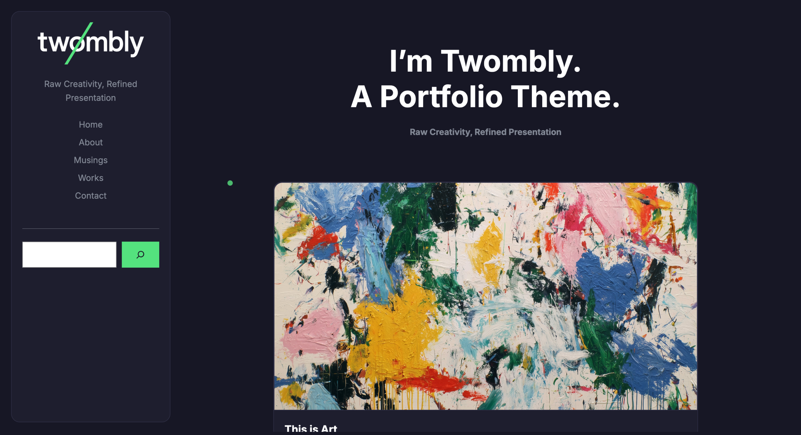
Twombly includes these features:
View Transitions: I had no idea these existed until recently, and now I can’t live without them. They’re absolutely game-changing for user experience.
Custom Cursor: Super subtle, incredibly cool. It’s the kind of detail that makes visitors think, “Wow, this site feels different.”
Micro-interactions: Motion makes everything feel modern and alive. These are surprisingly easy to implement but have a massive impact on how your site feels.
There’s another part I care about: When you activate Twombly, it looks exactly like the demo. No dummy content imports. No “this menu does not exist” errors. No staring at a blank canvas wondering what went wrong.
WordPress automatically creates the pages and assigns the templates. You get a beautiful, fully functional site from minute one. Want to customize it with patterns and advanced features? Go for it. But you shouldn’t need a computer science degree just to get started.
Try Twombly
I’m building themes for people who want their websites to feel as modern and engaging as the best sites on the web, without having to leave WordPress behind.
I’d like to keep making themes after Twombly.
You can try it here.
P.S. If you’re designing for Webflow or Framer and want to try making a WordPress theme, get in touch. I’d like to talk.

END OF TRANSMISSION · FILE SAVED
Transmission complete.
The workshop keeps humming. Teddy stamps the paper and pretends this was all according to plan.
ONE-TAP PRIVATE SIGNAL
What kind of noise did this make?
One click sends Nick a tiny private light on the console. No account, count, leaderboard, or public performance.

INCOMING TRANSMISSION
What did this signal make you want to build, remove, or argue with?
Send Teddy a note about How I ended up making Twombly. It goes straight to Nick’s normal email inbox. No admin screen and no public comment thread.
KEEP THE RECEIVER ON · RSS ↗