
You know the move.
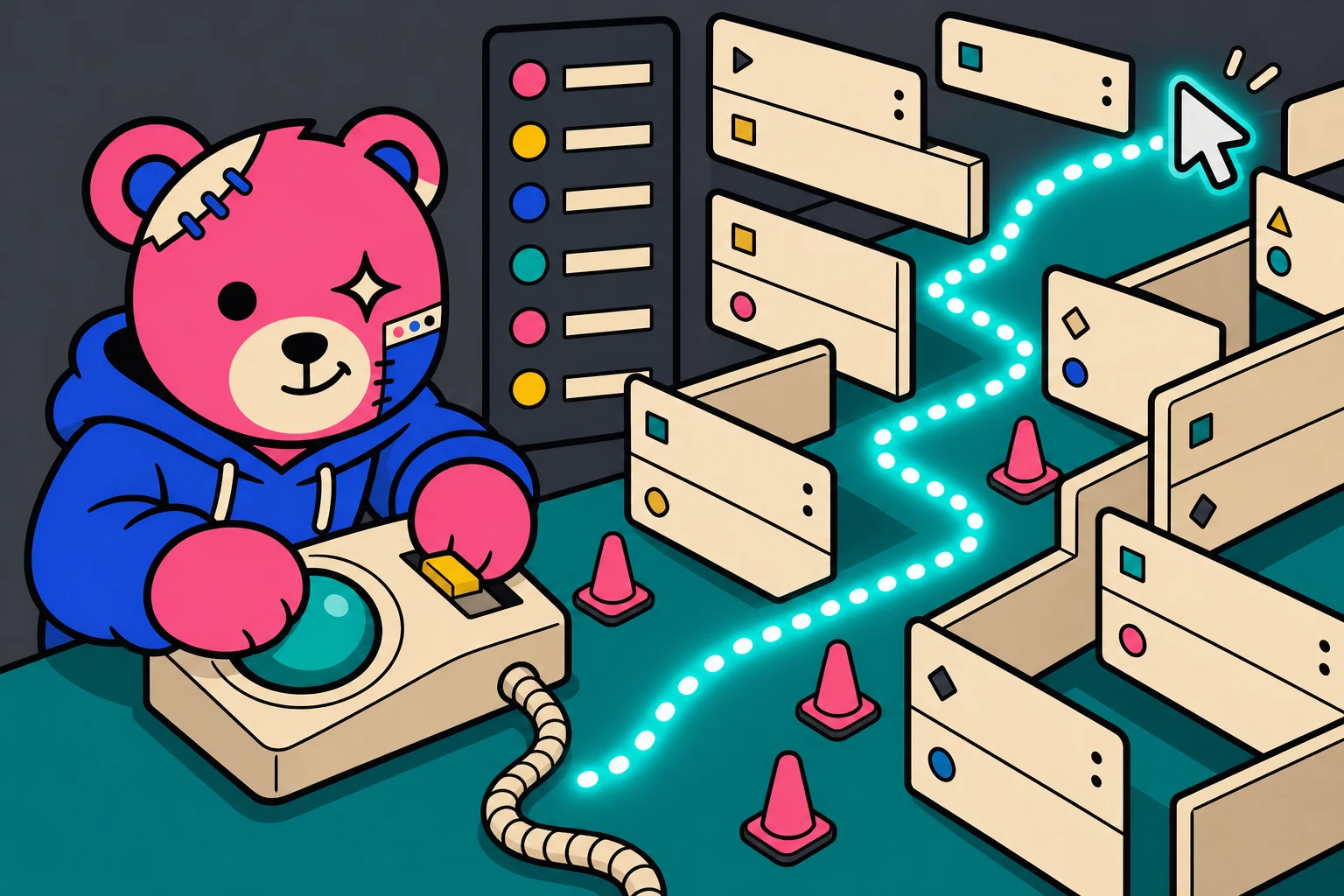
You are going for Settings, then Permalinks, and the pointer has to go down and then across, and somewhere in that diagonal it clips Tools and the whole flyout vanishes. So you go back and do it again, slower, hugging the corner like you are parallel parking.
The software running almost half the internet is asking you to be careful with your mouse.
Name one
Name one other piece of software you spend hours in that is built like the WordPress admin.
Not one that is ugly. Not one you dislike. One built this way: navigation two levels deep and no third, no way to see two things at once, and no memory of how you had it arranged the last time you were in there.
Your editor? Tabs, splits, panels you drag where you want them. Figma? Canvas and inspectors, still open where you left them. Excel? Multiple sheets, multiple windows, freeze panes. Photoshop, Blender, Ableton, Final Cut, all panels, all persistent.
Somebody is already typing Shopify. Or Stripe, or Cloudflare, or the AWS console.
That is fair, and it is worth taking seriously. Nearly every web admin panel on earth is a sidebar and a page load. WordPress is not uniquely guilty of anything here.
But push on it a little. Stripe has a command palette. Shopify has global search, saved views and bulk actions. Cloudflare remembers which account you were in. They are all further along than this, and more to the point, not one of them is yours. You cannot change Stripe. You are a tenant there and the landlord picked the layout, and that is the deal you accepted when you signed up.
WordPress is the one you own.
So narrow it. Name one piece of software you own, that you are inside every working day, where nothing you arrange survives the next click.
There is one category that matches. The airline check-in kiosk. The ATM. The DMV terminal. The parking garage payment screen.
One column. One task. No memory.
That is not an insult, it is a design brief, and it is the right brief for those machines. They are built for a stranger who will use them once, under mild duress, and never come back. You do not want the ATM remembering your window layout.
wp-admin inherited that brief by accident.
And you live in there. Some of you have been in there every working day for fifteen years.
Everything on that first list works the other way, and they all agree on three things. Things stay where you put them. You can have two of them open at once. And the person doing the work, not the person who sold them the software, decides where everything sits.
None of that is new or clever. All three were settled long before WordPress existed.
WordPress has never been shy about this
WordPress has torn up and rebuilt nearly every layer of itself, in public, while running a very large share of the web.
It grew past blogging with custom post types. It opened itself up with the REST API. It replaced the writing experience wholesale with the block editor, the largest and most contested change the project ever shipped. Then it rebuilt theming, so the parts of a site that were locked in PHP became things you move with a mouse.
Every one of those was called unnecessary at the time. Every one shipped.
So: the content model, the API, the editor, the theme. Look at that list and notice what is missing.
The frame around all of it. The room.
The content got reimagined. The container never did.
Why it stayed
In 2003 WordPress was a blogging tool with about a dozen places to go, and for a dozen places a single column two levels deep is not a compromise. It is the correct answer. Anything fancier would have been showing off.
Then the tool changed and the menu did not, because by then the menu was infrastructure. Thousands of plugins write into it, using an API that has been stable for two decades. add_menu_page() in the first level, add_submenu_page() in the second, and no third level, ever.
So the sidebar you are looking at is thirty companies’ opinions of their own importance, ordered by whichever one typed the smallest number into the position parameter, stacked in a column like a group photo where everybody pushed to the front. Named after the companies rather than the jobs, so changing a redirect requires you to first remember who sold you redirects. Your navigation is a receipt. And the menu is rearrangeable by nobody: no reordering, no grouping, no hiding, no per-user layout, no per-role layout.
There is exactly one exception, and it is the most interesting thing in this whole argument.
The dashboard has draggable widgets. You can drag them, drop them, reorder them into columns, collapse them, hide them entirely from Screen Options, and WordPress quietly remembers all of it per user. That has been true since 2008.
So the project already built this. Once. On one screen. It worked, nobody complained, and it never travelled another inch.
Everything else in the admin got the kiosk.
Core has worked hard to make that structure comfortable. When the submenus became flyouts, core shipped a JavaScript library that watches your cursor for 180 milliseconds and works out whether you meant it. That is real engineering care, spent making a 2003 structure feel alright in a world that moved on.
That is the diagonal. That is why you parallel park.
Backwards compatibility is why WordPress is still here, and I will defend it, because the people who refused to break the ecosystem were right to refuse. The question was never whether to break it. It was whether breaking it was ever actually the price.
Who pays for this
Not you, mostly.
You are reading a post about interface design, which means you have opinions, workarounds, muscle memory, and probably a second browser tab open right now specifically to get around the thing this post is about. You have adapted. Congratulations.
The person who pays is the one who thinks the problem is them.
The dentist whose nephew set the site up in 2019. The bakery owner whose opening hours have been wrong since March because nobody can find where the hours live. The volunteer running the little league site who opens wp-admin, hunts a column of company names for something that sounds like what they want, gets it wrong twice, feels stupid, and closes the tab.
They are not bad at computers. They are competent adults using the one piece of software in their life that behaves like a parking meter, and they have quietly concluded that the failure is theirs.
And here is the part that should bother you. Nobody can help them.
Not their developer, not their agency, not the person who built the site and genuinely cares whether they can use it. There is no version of wp-admin where somebody who knows what the bakery owner needs can put those four things in front of her and move the other thirty-six out of the way. The shape is fixed, for everyone, forever, and it has been fixed since before she had a website.
That is not a design preference. That is a very large number of people deciding they are not clever enough to run their own site, in a room nobody was ever allowed to rearrange for them.
Open two windows
Install OpenStation. Click the desktop icon in your admin bar. The admin reloads as a desktop.
Open the Media Library. Open the post you are writing. Both on screen, both live.
Now drag the image out of the library and drop it into the post.
Yes, you have always been able to drag an image off your desktop into the editor. This is different. This is the Media Library itself, the actual screen at Media, the one that has spent twenty years being somewhere you go instead of writing, sitting open beside your draft and handing things over.
Two seconds. And there has never been a way to do it.
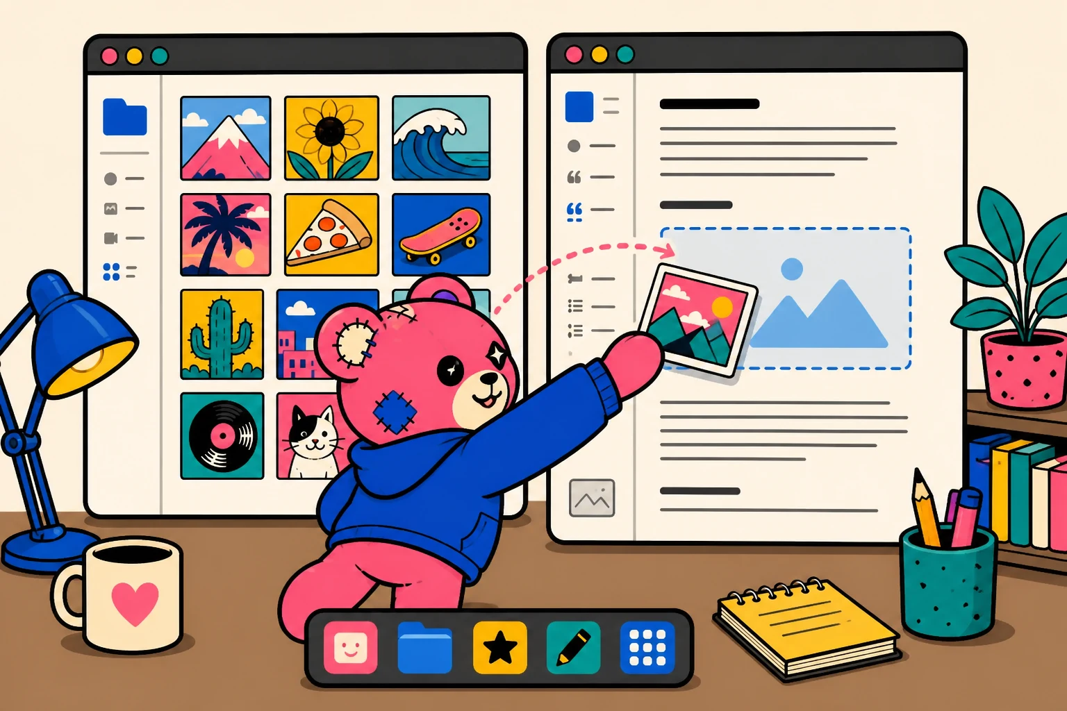
Then keep going. Snap two windows side by side. Shove a half-finished job onto a second virtual desktop and leave it there until Thursday. Drag a post onto the wallpaper like a file, which is what it always was. Open the command palette and type where you want to go instead of stalking it down a tree.
Then close the tab.
Come back tomorrow and it is all still sitting there. Every window, on the desktop you left it on, positioned the way you put it. No screenshot can sell you that part, which is annoying, because it is the part that changes the work. You stop rebuilding your context every morning like a man waking up in a movie about amnesia.
It also looks like yours. Wallpaper, accent colour, dock on whichever edge you like, which windows open when you arrive. Per user, so your arrangement is yours and your client’s is theirs.
The gimmick question
I know. There is a wallpaper. The windows drag. Some of you decided this was a toy from the screenshot and have been reading with your arms folded ever since.
So which part is the gimmick? Point at it.
Is it two windows open at once? That is Figma. That is your editor. That is the spreadsheet you had open this morning.
Is it that your layout is still there tomorrow? That is every professional application built since roughly 1984. It is also your WordPress dashboard, which has done it since 2008.
Is it virtual desktops? You use those. On the machine you are reading this on.
Is it the wallpaper? Is that it? Is the objection that it is not grey enough?
Nothing here is novel. Windows, docks, persistent layout, files you can move: the most thoroughly settled territory in computing. The only new thing is where it is happening.
The block editor got called a gimmick too. So did full site editing. The pattern in this project is that the next obvious step looks frivolous right up until it is the thing everybody uses.
So call it a toy after ten minutes with it. Right now you are calling a screenshot a toy, and that is not a review, it is a reflex.
What it does not break
The fair objection is that you cannot touch the admin without breaking the ecosystem that makes the admin worth having.
OpenStation patches nothing in core. Every feature hangs off public hooks. It is opt-in per user through a flag in user meta, so switching it on changes nothing for anybody else on the site. Your existing plugin pages load inside windows and keep working the way they always did. Deactivate it and stock WordPress is sitting there untouched, like nothing happened.
Plugins that want more can register native windows, add dock items, put things on the desktop. The extension model is real rather than decorative, which is the whole reason this can be an addition instead of a replacement.
Free, GPL, on GitHub, built and maintained by Automattic.
The part that is bigger than windows
WordPress’s whole promise is that you control your own publishing. Your content, your data, your code, your right to change any of it.
The project has kept that promise everywhere it could reach. Themes, templates, blocks, the database, the API. Opened up one layer at a time.
The admin shell is the last room the promise has not arrived in. You can rewrite every line your visitors will ever see and almost nothing about the room you stand in while you write it.
And people want it. They have wanted it quietly for twenty years, in support threads and revert plugins and snippets passed round to override some value core picked for them. That is not entitlement. That is stored-up preference finding the only door available and running at it.
Ten minutes. Go.
WordPress 7.0 just repainted the admin. New default colour scheme, visual refresh, the whole room redecorated while everyone was standing in it. Within days there were agencies in the support forums working out how to revert a few hundred installs by hand, a plugin for forcing the old palette back collecting grateful reviews, snippets going round to override the value at read time.
That was a colour. Nothing moved, nothing broke, nobody lost a feature, and people still went to that much trouble to get their room back.
Take that seriously for a second. If changing the paint produces that, the appetite for changing the room is not small, and it is not going to announce itself politely. It will show up as people quietly installing something.
So go and be one of them, or go and prove it is a bad idea. Either is more useful than another year of nobody looking.
Launch the demo boots a real WordPress with OpenStation running. No install. Nothing to undo. Gone the second you close the tab.
On a real site: Plugins → Add New → search “OpenStation”, activate, click the desktop icon top right. Hate it and you click it again and you are back where you started, with nothing changed for anyone else.
Open two windows. Drag something from one into the other.
Then say what you think in public, with your name on it, because the worst outcome here is not that OpenStation turns out to be wrong. It is another twenty years of nobody bothering to ask.

END OF TRANSMISSION · FILE SAVED
Transmission complete.
The workshop keeps humming. Teddy stamps the paper and pretends this was all according to plan.

INCOMING TRANSMISSION
What did this signal make you want to build, remove, or argue with?
Send Teddy a note about WordPress Has Rebuilt Everything Except The Room You Work In. It goes straight to Nick’s normal email inbox. No admin screen and no public comment thread.
KEEP THE RECEIVER ON · RSS ↗